Mobile Home: Do Ho Suh’s ‘New York City Apartment/Bristol’
October 6, 2015
Peeking through a sparkling pair of glass doors, I spy an eerie, pale aqua coloured ghost of a building. Hiding in the art galleries, upstairs at the Bristol Museum and Art Gallery, between walls of Victorian and Edwardian classical depictions of famous literary works, is an excerpt of Korean contemporary artist Do Ho Suh’s enticing installation art.
The piece featured here at B-MAG is part of the larger ‘348 West 22nd Street’. Adopting the same 3-dimensional drawing principles used by architects, Suh has created a skeletal facsimile of the multiple stories of his home in New York. Due to limited exhibition space, or specifically height, you only get to see a section of the work here, which fluctuates from gallery space to space.
Reflected in the title, which has also changed throughout the exhibition’s journey, ‘New York City Apartment Corridor/Ground Floor plus Staircase/Bristol’ is a piece that interacts with, explores, and discusses space. The huge benefit to the B-MAG’s lacking size is that, unlike in other gallery spaces, the installation is at ground level, rather than consisting of a series of stories atop one another, suspended from the ceiling. You can, therefore, actually walk through Suh’s art/apartment.
Suh’s creative career began when he moved from his native South Korea to the United States to attend Rhode Island School of Design, where he studied both architecture and pattern-making, before progressing on to Yale University School of Art. Since his first geographical relocation, Suh has explored his own interactions with spaces and buildings, always returning the idea of the house or home. In The Poetics of Space, French philosopher Gaston Bachelard asserts that “the house is one of the greatest powers of integration for the thoughts, memories and dreams of mankind”. To me, ‘New York City Apartment’ is both an artistic representation of this notion, and a public physical space with which anybody is welcomed to interact.

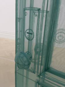
Entering through the open door, I am immediately drawn to the intense attention to detail – everything is stitched in life size, with incredible accuracy, down to the branding on the keyhole. Contrasting with the minute details, the majority of the piece is minimalistic and open and, being constructed out of transparent fabric, you are afforded a clear view of the empty gallery space beyond the flimsy walls. The effect of this is to create a layered view of the existing space; rather than simply showcasing an imitation of his New York home, Suh reinvents the entire room. In being permanently open, the door also encourages you to consider the boundaries of public and private spaces. Stood inside the walls, I am able to have a clear conversation with the wonderfully well-informed exhibition guard, as he circles the see-through walls of the building, and I quietly consider how the public and private spaces are merging.
The B-MAG exhibition information quotes Suh as having said: “My desire to guard and carry around my own intimate space makes me perceive space as infinitely moveable. I experience space through, and as the movement of displacement. Space for me becomes intrinsically transportable and translatable.”

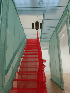
Considering this, I find it interesting that the areas of his apartment on display here are transitory spaces that encourage movement – a corridor, and a staircase, whose general purposes are to connect other more permanently inhabited spaces. Extending his intention beyond the aesthetic and conceptual, Suh built the installation in such a way that it is actually mobile, easily deconstructing to fold into two standard suitcases.
Despite its technical beauty, however, the installation has a sort of hollow, unhomely atmosphere; I do not stay inside the walls so long out of a curiosity to experience Suh’s private space, but because I feel that ‘New York City Apartment’ raises interesting questions about ‘home’ and what that really means. Looking up the bright red stairs, which lead to the empty gallery air above, I feel that this segmented, transitory, open-ended installation will continue to encourage discussions as long as its door remains open and it persistently distorts traditional notions of the mobile home.
Follow Hannah Emadian on aseparateworld.tumblr.com
Filed under: Art & Photography

Comments