Tate Modern’s Switch House
August 18, 2016

This June the Tate Modern opened a new 10-storey building, known as the Switch House. The new building means to make modern art more accessible to modern audiences, to introduce more interactive projects to visitors and to display a more international collection.
Having long been a supporter of movements in contemporary art towards a more accessible and interactive mode of viewing within galleries and museums, I was eager to see how Tate was going to tackle the difficulties of presenting live art installations and performance based works. Excited by the prospect of the Tate’s extension I travelled to London to spend a day exploring what promised to be an important and interesting new space for the display of modern art.
In many aspects the Switch House exceeded my expectations. It’s filled with art that most visitors to the museum will probably not have seen, from artists they’ve probably never heard of and this is a wonderful thing not only for obvious reasons that it widens our perspective and increases our accessibility to a wider range of artists from a greater range of places. Also it can enhance the way that we view art within the gallery. Often a trip to an art gallery will involve being drawn towards name plaques of artists we recognise, or pressure to enjoy artworks by artists we know are ‘great’. In the new section of the Tate Modern, with its far greater range of artists and less, for want of a better word, ‘obvious’ choices we cannot necessarily rely on our knowledge of artists for our enjoyment of the artworks. We can be drawn towards artworks, or choose to pass swiftly pass them, purely based on how we respond to them visually rather than choosing to focus on those we recognise and can immediately understand.
The Tate has also succeeded, finally, in their acknowledgment of female artists. When the gallery first opened in 2000, 17% of the art on display was by women. Now more than half of the solo displays are dedicated to women artists.
For me, it was the work of four of these women artists that provided the highlights of the Switch House displays:
Suzanne Lacy’s ‘The Crystal Quilt (1985–7)’. A collaborative and public artwork, taking place over three years in Minneapolis, Minnesota, it explored how the media portrayed ageing. Incorporating many types of practice, from art exhibitions and lectures to community organising and a leadership seminar for older women, it culminated in a performance on Mother’s Day in 1987. 430 women over the age of 60 gathered to share their views on growing older. The resulting participatory performance included mass action, spoken word and sound, and was broadcast live on television and attended by over 3,000 people. Participants all wore black, and engaged in simple actions using their hands, manipulating tablecloths to create a ‘quilt’ pattern that created a large-scale spectacle of participation. The soundtrack to these movements included the women’s own voices, mixing personal observations and reminiscences with social analysis about the unused potential of the elderly. The work is displayed in the form of a video documentary, quilt, photographs, and sound piece, combining the original elements of performance, activism and broadcast in an ambitious way that successfully gives an insight into the original performance.
In a floor given over to explore the theme “performer and participant” the work of German artist Rebecca Horn is displayed using the clothing, headdresses and weird body accouterments she used in her performances. Following a serious illness, the German artist spent several months in hospital, aged 24. Forced to remain in bed in isolation while recovering, she made a series of pencil drawings depicting human bodies with various physical constraints or prostheses. She then started producing these objects as wearable sculptures made out of fabric, feathers, metal, and wood. Loosely based on medical tools or animal anatomy, the function of these objects is not immediately obvious and may appear at turns pleasurable or threatening. For Horn, the idea was “to work with the body having connections with another body”. As her health improved, Horn started filming herself and collaborators wearing the body sculptures and using them as props in performances enacted just for the camera. Many of these actions investigated the relationship between a body and its environment, others focused on particular movements and interactions between participants. Excerpts of the resulting short films can be seen on the monitor in this room.
Ana Lupas’s ‘The Solemn Process (1964–2008)’ is a large-scale installation comprising twenty-one unique metal sculptures of varying dimensions and forms, as well as two large wall vinyls, each displaying a grid of forty sepia-toned images. Romanian artist Ana Lupas created it over a period of five decades. Beginning in 1964, Lupas oversaw the creation of large straw structures in villages in Transylvania. She enlisted the help of villagers who used weaving techniques traditionally employed to make wreaths for harvest festivals. Lupas originally saw the artwork as the communal act of making and displaying these objects in the local area. The project developed in this way, but by the mid-1970s, the economic and social changes in Romania made it difficult for participants to continue. Lupas could no longer ensure that new objects would be made each year. This changed the status of the structures from products of an ongoing process to relics. Lupas tried different ways to preserve them, first by restoring the original wreaths, then by drawing them, making more than 200 drawings. Eventually, in the early 2000s, she developed the technique of sealing them in metal ‘tins’. This solution satisfied the artist as a practical means of preservation and a way of combining the natural and traditional ‘wreaths of wheat’ with modern, industrial associations through the metal casing.
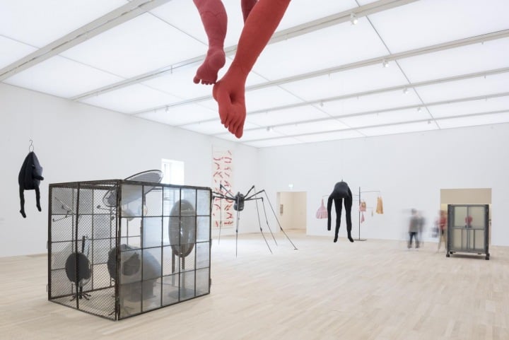
A whole room is given over to the work of Louise Bourgeois. Autobiographical while also addressing universal experiences such as birth, death, love, loss, and fear, Bourgeois’s works span seven decades and use recurring motifs such as spiders, mute and gaping heads and limbless torsos. The room is filled with ideas reworked and remade in sculpture, drawing, writing, and installation. The anxiety and insomnia Bourgeois suffered from for most of her life comes across in the frantic and desperate way in which she stitched, carved, cast and assembled her art using marble, bronze, stuffed fabric, using her materials in unique and emotive ways making references to the body and body-parts.
Despite these triumphs, there are a number of fundamental problems with a gallery such as Tate attempting to house the sort of work the Switch House does. Basic problems such as the sheer size of the building, the vast amount of artworks it displays and the great numbers of people.
These problems were summed up for me well in the display of Hélio Oiticica’s ‘Tropicália’. It includes two structures: PN2 ‘Purity is a Myth’ and PN3 ‘Imagetical’. Oiticica called them ‘penetrables’ because people are encouraged to enter them. They mimic the improvised, colourful dwellings in Rio de Janeiro’s favelas, or shantytowns. Live parrots, lush plants and sand complete the installation and give a sense of the tropical character of the city. In ‘Tropicália’, Oiticica wanted to give contemporary art a specifically Brazilian character. He introduced the disorder, resourcefulness and communality of lived experience into the artwork, employing Brazilian reality to subvert the ‘purity’ of European modernism. I had seen the work a few years previous in Tate Liverpool and had spent time wandering through the work, taking it in. However here in the Switch House the work stands at one end of the room, a barrier put between you and it, disallowing you from travelling through the work and contemplating it. Instead of the macaws usually seen to be clambering around and making noise there is a sign saying that the macaws had to be removed due to high numbers of visitors scaring them.
To me this work being displayed is not Hélio Oiticica’s ‘Tropicália’. I’m all for the preservation of art and am against animal cruelty so it is not to say that I think they should have shown it in its original form, but I just think they shouldn’t have shown it. Because as it is, it is pointless, and it gives nothing to the viewer that is reminiscent of what experiencing it properly can.
Robert Morris’s waist-high mirror cubes among which visitors thread their way, watching the surfaces appear and disappear according to their changing presence, have become a photo opportunity with people taking photos of their reflections in the mirrored glass.
It is really refreshing to see people engaging physically with artwork and getting excited about it. With the constant interaction, however, it feels like the meanings of work often gets lost. You can find yourself wandering around looking for the next interaction and forgetting to actually contemplate the work and your contact with it.
In 2007, Doris Salcedo’s ‘Shibboleth’ was a crack in the Turbine Hall floor, running the length of the building, which may be read as an assault on the museum and the Western art world, a threatening structural weakness that suggests the instability of the current balance of exchange in culture as well as representing a fault line in society between the rich and the poor and between whites and non whites. However its installation in the Tate’s Turbine Hall led it to become a site of physical play at odds with the artist’s intended meaning. It was used as a place to stick one’s toes, drop small items into, jump over, pretend to trip over, and giggle at. Soon after it’s opening, it was decorated by Tate health and safety notices.
I think participatory art that encourages interaction, creativity and engaging the brain is a positive thing, but when it is placed inside the Tate it no longer occupies the subversive and anti-authoritarian force that it should.
The Tate has come to rely increasingly on installation art as a way to create a memorable, high impact gestures within large exhibition spaces. A gallery such as Tate with its reputation and strong branding sets the tone and meaning of the artwork within it, when it really should be other way round. A museums branding can spread into an institution’s general operations, and distorts the way viewers see and think about works of art. The majority of the artwork shown in the Switch House was born out of struggles and conflict, whether personal or political and holds subversive and disruptive messages. Taken out of their original contexts and placed amongst so many other works with a vast array of meanings their power gets slightly lost. My four highlights that I described before were all displayed in rooms dedicated to that single artist and in the case of Lacy and Lupas’ to a single work. This approach to display allows for much more contemplation and time to spend with the work, unable to be distracted by the next work along or the overwhelming amount of ideas available to take in.
I would recommend a visit to the Tate because it contains a lot of beautiful and inspiring art. Though don’t attempt to see it all at once, rushing around from room to room, because that is not how most of the work displayed were intended to be seen. Choose a few artists or artworks to concentrate on, take time to consider them and try to ignore the fact that you’re in the Tate Modern along with thousands of other people!
Filed under: Art & Photography
Tagged with: Ana Lupas, contemporary art, curating, Installation art, London, Louise Bourgeois, Rebecca Horn, Suzanne Lacy, Tate Modern


Comments